
First is the frequency with which reservation lands go for the Democratic candidate. Across the Midwest and southwest, even in New York State many of the areas voting most often for the Democrat include or wholly consist of reservations. It appears that many (though not all) Native Americans tend to vote Democratic for President.
| Montana | Glacier County/Black Feet Ind. Res. |
| Blaine County/Fort Belknap Ind. Res. | |
| Big Horn County/Crow Ind. Res. | |
| New Mexico | McKinley County/Zuni and Navajo Ind. Res. |
| Rio Arroyo County/Jicarilla Apache Ind. Res. | |
| Arizona | Apache County/Navajo, Zuni and Fort Apache Ind. Res. |
| South Dakota | Shannon County/Pine Ridge Ind. Res. |
| Todd County/Rosebud Ind. Res. | |
| North Dakota | Rolette County/Turtle Mountain Ind. Res. |
| New York state | Erie County/Cattaraugus Ind. Res. |
| Franklin County/Mohawk Ind. Res |
So while the trends of Native Americans on reservations and unionized miners typically voting for Democrats are put into stark relief by the overwhelming majority of the West voting Republican, a perhaps more interesting trend is the confusion of results in the middle of America. It is fascinating to contemplate the reasons behind the hodgepodge of results up the Mississippi River valley and across the south. We can think of no good explanations except to mention the size of the counties (much smaller than in the West) offering more data points, increased population density in these areas with lots of water and fertile soil, and the mix of farming, cities, transportation and industrial jobs that are not in such close proximity across the West. It appears as if these parts of the country cannot make up their mind which party to support, a fact of great interest to candidates for President.
| Values | Label |
|---|---|
| -7 | Solid Republican |
| -4 to -6 | Mostly Republican |
| -1 to -3 | More Republican |
| 0 | Tied or No Data |
| 1 to 3 | More Democratic |
| 4 to 6 | Mostly Democratic |
| 7 | Solid Democratic |
| VALUE | Grid Cell Count |
|---|---|
| -5 | 2 |
| -3 | 379 |
| -2 | 510 |
| -1 | 53627 |
| 0 | 457 |
| 1 | 385869 |
| 2 | 4402 |
| 3 | 213318 |
| 4 | 4366 |
| 5 | 131109 |
| 6 | 626 |
| 7 | 34862 |
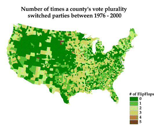
While the possible range of results was zero to 6, the actual result of the addition of the six pair maps was a range of 0 to 5. See below for the distribution of grid cells by value. No area changed parties every election, but several did 5 out of six possible times. The preponderance of value zero is attributed once again to the large areas of the West that never changed parties. An examination of some of the counties that did switch often shows they are fairly small in area.
This map shows more clearly than others that, despite the West's apparent domination (which is due to large county sizes), every region of the country has counties that solidly vote for a single party.
It is certainly necessary for candidates to visit locations where the voters are faithful to a single party, but they need not spend the majority of their time, energy, focus and money in those areas. Give them enough attention that they are reassured you believe in the principles of their party. However, the battles for converts are best fought by the party itself rather than any given candidate.
Candidates need to focus on areas where races are close, where there are lots of votes, and of course where there are lots of electoral votes to be had. See below for a cartogram of electoral votes by state. The more electoral votes a state has, the more important it is to the candidates.

(http://www.guardian.co.uk/US_election_race/graphic/0,5543,393512,00.html)
Accessed Nov. 4, 2001
In the end, we think this project has provided some valuable information regarding the polity in the United State. A campaign committee could use this in the following manner: The focus group is now a standard tool for political campaigns and parties. They are used to help determine what messages will be popular with voters, as well as (to a smaller degree) what issues a candidate needs to take a stand on (and which stand). However, in order to provide useful information, the focus groups must accurately represent the voters a candidate is trying to appeal to.
Two of the maps (and especially the underlying data, accessible with the select tool) could be extremely useful in determine the make-up of focus groups, as well as where to hold focus groups (and where to conduct polls).
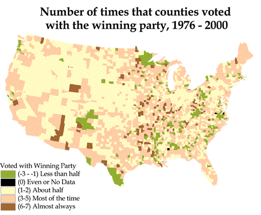
Regardless of the candidate's party, those counties that vote with the winner will be of great interest. This map shows the number of times each county has voted with the winning party over the past seven elections. While the past is certainly no perfect predictor of the future, it's one of the few tools we have to work with. By looking up the counties that always vote with the winning party (and there are many) this map can provide guidance on both where to find the voters who have been most in tune with political winds, and what the proper demographic mix may be when trying to find a representative set of voters to poll. It can be used the other way, too. It may also be valuable to know the demographic mix and beliefs of the counties least likely to vote with the winner so as to avoid appealing to those voters!
Once a candidate's team knows where the nation's opinion leaders live, it's also helpful to know where your party's most solid voters are. The Party Loyalty map provides this information. This will help a candidate craft their message for the primary election contest, where the candidate must appeal to the interests of the party loyalist. Candidates cannot win either primaries or general elections without the endorsement of state and local party leaders. Knowing the areas and demographics of counties that vote consistently for your party can help you craft your message to appeal to those important voters.
After a candidate's team has crafted their candidate's message to appeal to proper set of voters, then it's time to go on the stump. Candidates need to travel and make appearances to groups that will help them win the election and to the public in areas where the media attention will help convince voters to vote for them. They also have to decide where to spend their very limited publicity budget on media buys. They must strike the right balance between preaching to the choir (who must not be neglected or they'll fail to be enthusiastic, which translates into campaign donations of time and, most importantly, money) and waging the campaign in areas where voters can be persuaded to vote for a candidate. Complicating the situation is the unique challenge of the Electoral College. In truth, candidates are only peripherally concerned with vote counts because what truly matters is winning a combination of states that will give them 50% +1 of the Electoral College votes. A smart strategy is to spend effort in states with lots of Electoral College votes, especially in counties where the race is competitive (the outcome is not preordained) and there are lots of voters.
The above map provides a unique example of the impact of the Electoral College. It can be referred to as memory jog to remind the team which states are most important. Either way, the next step is to find out where in the state the voters live, especially those that can be swayed to vote for you. The voting population map can help focus on where the most voters live. This is not a straightforward picture of population distribution. Rather, it shows which counties had the most votes cast in the 2000 election. It gives extra weight to those counties where voting rates are high. The final step is to use voters by area map to determine where media buys can reach the most voters per square mile, assuming a media buy stays in a particular county (This is probably less useful than the voting population map).
The authors feel that following these prescriptions, based almost entirely on the GIS analysis described earlier, can provide Presidential candidates with information critical to making the most of a candidate's time and resources. This same analysis model could be used for elections at different scales, provided the data is available. Precinct-level data is almost a requirement for contest below a statewide level. Because of the requirement for lots of spatial data it may not be appropriate for cities, except for the very largest. It would be difficult to get data at a fine enough resolution to be useful in very small areas.