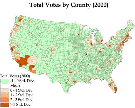
The 2000 election results shapefile was added to the view as a new theme and displayed showing the field Total (meaning total number of votes cast in each county) as a graduated color map classified by standard deviation. We felt that standard deviation provides the best representation of the clustering of voters in this instance.
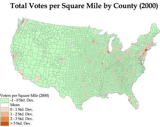
In case there were questions about population density not being taken into account when looking at raw votes per county, we also controlled for area. We also created one final theme showing 2000 vote results Total as a graduated color map classified by standard deviation and normalized by area.